How to Properly Place an Area Rug
I’m almost ashamed to admit the amount of times that I’m looking at beautiful home photos online, admiring the feel of the room, the stunning lighting, the gorgeous styling and then it happens… slowly my eyes drift down to the area rug and all the good feelings I had for the room just vanish. All I want to do is reach in and give it a little pull to make it right.
Getting the rug placement correct is all about laying a good foundation for the room. When it comes to design and styling, it’s one of the pillars of your room and it’s important to get it right. To help you nail this in your own home, I’m sharing my top 5 tips for rug placement below!
Area rugs: big impact, big style, big expense. Consider these ideas to get the most impact from one of the bigger investments in your decor!
My top 5 tips for getting that area rug placed just right:
1. The rug is an anchor & an island
The rug should be the visual anchor for most of the elements of the room. Rug placement has to do with balance and harmony. It’s a large item in the room and its placement needs to fit into the space well as well as visually bring everything together that wold otherwise be visually ‘floating’ in the room.
Think of your empty floor as a wall and the rug as a large piece of statement art. Its position needs to be balanced within the room (as a large piece of art would be balanced on a wall) and anchor the smaller items in the room like the furniture (as a large frame would house the art within it). There will be pieces that do not sit on the rug and you can liken this to the smaller items that might hang on a wall surrounding one larger focal piece.
2. The placement needs to make sense in the room
The rug really needs to be centered on a major architectural element (fireplace, large windows, main focal wall) in the room. It doesn’t necessarily need to be smack dab in the middle of the room - you want its placement to be the island for the visual weight of the room. If it’s not in the middle, it needs to make sense (ie, centered on a large picture windows or the fireplace). This is something that you are going to spend some time thinking about now, and when it’s done properly, neither you or anyone else will ever notice or think about again… but when it’s off, the entire room just feels off. It’s one of those intangible things that you often can’t put your finger on. The room will just feel unbalanced and it’s not obvious right away what the problem is.
As an example, some rooms have doorways and traffic paths on one side, creating the main seating area in the other. This is a classic case of placing the rug centered on the fireplace or a large window, or even a large TV console), rather than centering it in the room.
3. Balance it under the main furniture grouping
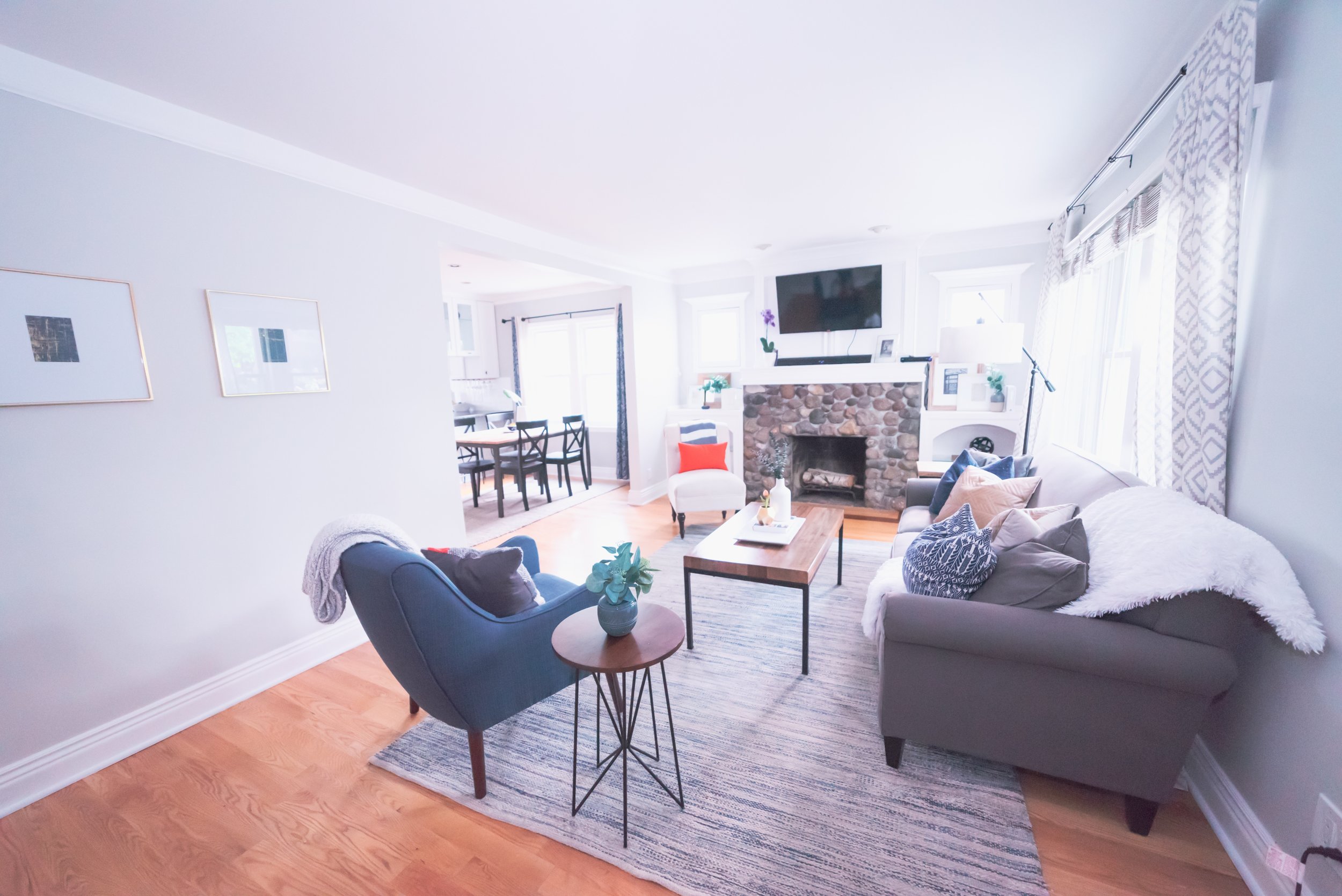
In rooms with any furniture at all, the rug is the anchor for the seating arrangement (or in a bedroom, for the main grouping - bed & nightstands normally). The furniture needs to be placed in a balanced way on the rug. In practical terms, this means that if you drew a line around the inner edges of all the sofas, chairs and side tables in your main furniture grouping (where your knees hang off of a chair, for example), that circle needs to be balanced on the rug.
Now, remember that ‘balanced’ does not always mean smack dab in the middle. The rug could be under only the front part of a bed, or under a seating arrangement with more in front of the grouping than behind, or at an angle under a table in an odd-shaped dining area. This turns out to be something that is quite difficult to explain but very simple to see for yourself once you know to look for it!
4. Look at the legs
A good rule of thumb is that either all furniture legs are on the rug or all front legs are on the rug. This is mainly determined by the size of the rug or the size of the furniture. A large rug will have room for the entire grouping (all legs) on the rug but a smaller rug might mean the groupings back legs are all hanging off. This can also be a case of larger scale furniture, where the back legs need to be off the edges. Furniture is leveled with felt pads on the back legs when they are off the rug, sometimes more than one stacked on top of each other depending how thick the rug is.
In a bedroom, the rug is best placed sideways and pulled out from the foot of the bed as far as needed so that a warm place to walk is created starting from about 1/3 down the bed from the headboard and all around the foot.
5. Play with the angle
Turn the rug to get the look you want. The rug brings focus and importance to an area of the room and visually joins together all the smaller elements in that space, so don’t be afraid to try turning it a few different ways to see what works best to pull everything together. I try both horizontally and vertically and often at an angle as well before deciding the best placement. Ideally, you want to create a visual bubble around the seating arrangement and leave clear walking paths from room to room if needed, so think of placing the rug in whatever direction works best to accomplish that.
Rotate, angle, adjust, readjust. Don’t be afraid to try placing the rug several different ways before deciding on the best placement.
The rug should do three things in it’s placement:
1) frame the seating arrangement
2) balance or tie in any of the focal points of the room (the fireplace is the main one in a living room, but this could also be a media console that houses the tv or large picture window)
3) let the edges define the line between the seating area and the traffic flow (the main one I see here is angling the rug to create a traffic path through the room while defining the furniture arrangement as a separate area)
What not to do:
A few quick things to avoid:
Don’t place a too-small rug centered under a coffee table. It looks like it’s wearing a tutu!
Don’t use an area rug in a random place to fill an empty space. It would be like putting a statement broach on your arm - why? What are you calling attention to in that location?
Don't overuse small rugs. These are great for inside doors, in specific work areas like the kitchen sink and as bathmats… but look messy and kind of silly when scattered all over the floor. And no, more is not better. Again, this is a case where the rug should serve a specific purpose and be visually anchored to it’s space (the door area, the bathtub, the sink cabinet). Scale is also a factor here – small space means a small rug.
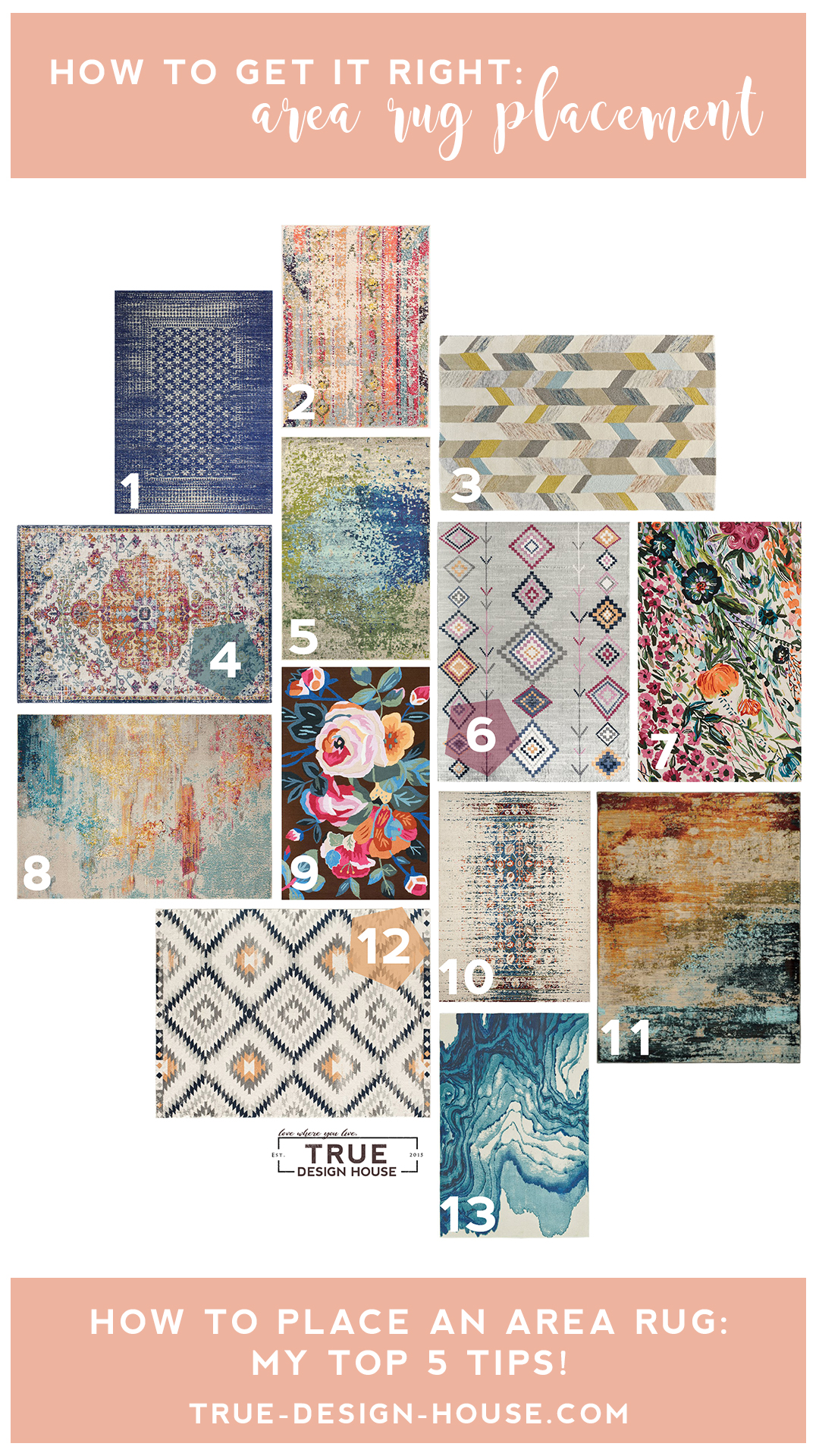
If you need some inspiration to get you thinking about creating a beautiful statement in your home, take a look at some of my favorites below!
Ready to love where you live?
Join 25 000 others for instant access to my library of free, practical, and down-to-earth interior design resources!
Want to Pin to save for later?
Here you go!


